.png)
The challenge
Help merchants list their products on the mobile app with a seamless experience
We needed to simplify the entire product registration experience and optimize it for mobile devices.
For this, we made several discoveries with the registration experience that was on the desktop and designed a completely different flow from what already existed.
For this, we made several discoveries with the registration experience that was on the desktop and designed a completely different flow from what already existed.
Main issues
The product listing flow was very complex and merchants struggled when they had to create detailed descriptions and other crucial information for their products. The desktop flow also had several bugs.
Expected outcomes
We set a success metric of at least a 30% flow completion rate, but the main expected outcome was to have better and more complete products registered on the platform, with better descriptions and categorization.
.png)
Our approach
Rethinking the entire user journey for the mobile app experience
As a first step, I documented the user journey within the existing product listing flow on the web app.
Together with the catalog squad product designer, we identified key pain points and opportunities to address by redesigning the product listing process from the ground up.
We also shared the documentation with the entire design team, inviting them to highlight design elements they felt needed changes or improvements.
The desktop product listing experience didn't offer any helpful tips during the product registration process
.png)
Multi-method research and user testing
During the discovery phase, I sent a quantitative survey to a segment of engaged Olist merchants to identify key gaps in the registration experience, validate or discard our hypotheses, and gather feedback on their current product listing process. I also interviewed five users to collect more detailed insights into the current experience.
Using these initial findings, I created a first prototype and conducted a usability testing with Maze.
The test provided valuable insights into how users perceived the new product listing flow on smartphones.
Using these initial findings, I created a first prototype and conducted a usability testing with Maze.
The test provided valuable insights into how users perceived the new product listing flow on smartphones.
.png)
Keeping it simple but efficient
The final user interface was designed to be clean and intuitive, with only one action per step. We noticed that showing too much information at once overwhelmed merchants, making the process feel confusing and difficult.
To address this, we collaborated with various teams across the company to create helpful tips for each step of the process, ensuring the copy was clear, concise, and supportive in guiding merchants through the flow.
To address this, we collaborated with various teams across the company to create helpful tips for each step of the process, ensuring the copy was clear, concise, and supportive in guiding merchants through the flow.
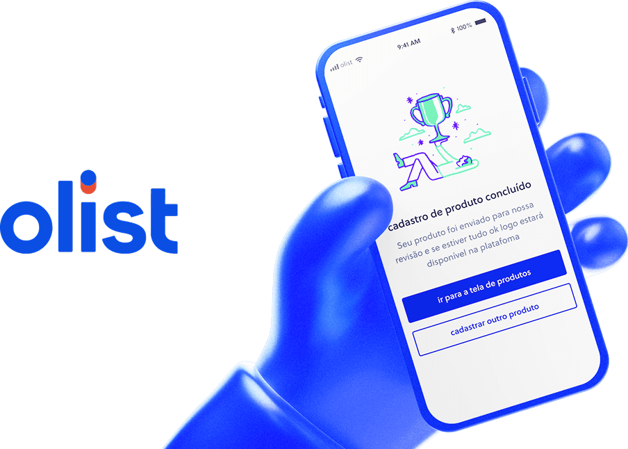
Designing a seamless product listing experience with useful tips and only action per step
.png)