.png)
The challenge
Learn from the MVP and redesign the entire user experince for new users
I joined the company as one of the first 25 employees, right after the seed round. Our main challenge as the design team was to build a consistent product that could position Diferente as the leading foodtech in Latin America within our sector.
To achieve this, we needed to revamp the website and checkout process, which had remained unchanged since the launch of the MVP.
We leveraged extensive data from Metabase, Hotjar, and Amplitude to inform our design decisions and clearly prioritize what needed to be addressed
To achieve this, we needed to revamp the website and checkout process, which had remained unchanged since the launch of the MVP.
We leveraged extensive data from Metabase, Hotjar, and Amplitude to inform our design decisions and clearly prioritize what needed to be addressed
Core issues
Analysis of Metabase, Hotjar, and Amplitude revealed key pain points in the buyer experience, indicating the need to improve the website and checkout. Customer support insights reinforced our decisions.
Expected outcomes
The primary goal of the user journey redesign was to improve conversions and potentially reduce the time to convert, while creating a more robust checkout to support upselling of other products.
.png)
Our approach
A clean and intuitive user journey with minimal friction, designed in collaboration with a cross-functional team.
We ensured that everyone involved in this initiative was engaged from the very beginning of the project. As a result, every aspect of the landing page and checkout process was reviewed by team members from marketing and growth, all the way to C-level executives.
I led several collaboration sessions, from brainstorming to design reviews, allowing everyone to share their input and be heard. This was a project shaped by many contributors.
Our main approach was to create a seamless buyer experience, as the previous design was cluttered and filled with distractions that diverted users from their goal.
.png)
.png)
.png)
The hard learnings
After launching the new landing page, our user conversion dropped to about one-third, significantly increasing our CAC.
At that point, it meant we were converting nearly 1000 fewer users per month.
At that point, it meant we were converting nearly 1000 fewer users per month.
How could a website that is visually cleaner and easier to use result in lower conversions?
It was clear to everybody in the team that we had improved the experience with the new design, but we weren't sure what went wrong in the process. What was driving conversions on the previous site?
Our first hypothesis was that the site had bugs or too many steps on the checkout, because we just went from a one page checkout to a multi step one.
Our first hypothesis was that the site had bugs or too many steps on the checkout, because we just went from a one page checkout to a multi step one.
.png)
Rapid iterations and hypothesis validation through A/B testing
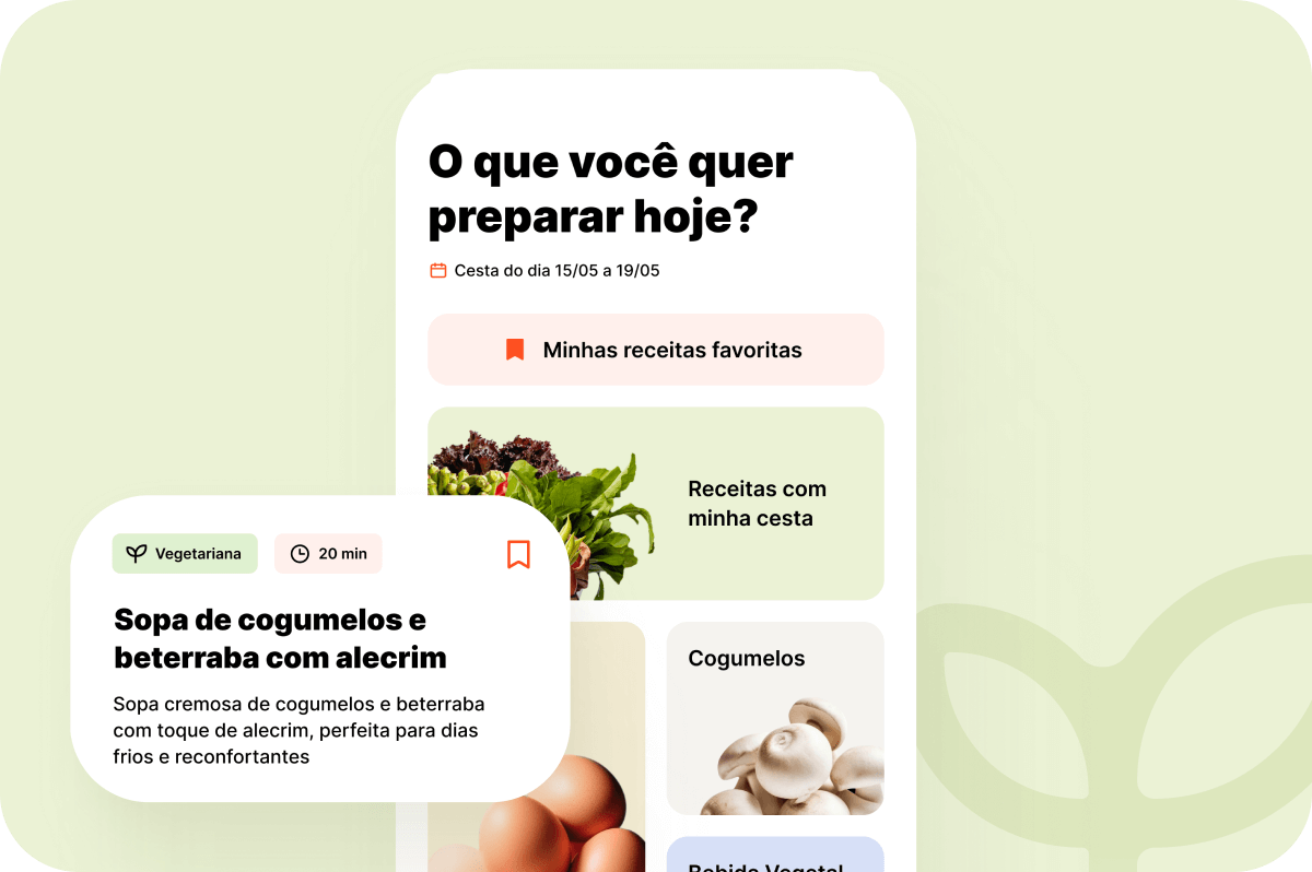
Over the next 2 to 3 weeks, we went through a phase of rapid iterations to identify what went wrong with the new design. We conducted multiple A/B tests, and one hypothesis proved to be true: vivid colors and appetizing images significantly boosted conversions.
With this insight, we kept the overall user experience and journey intact but updated the interface to adopt a more vibrant approach, using engaging images from the landing page through to the final checkout.
With this insight, we kept the overall user experience and journey intact but updated the interface to adopt a more vibrant approach, using engaging images from the landing page through to the final checkout.
It became clear that colors and appetizing images played a key role in driving conversions for food-related products.
.png)